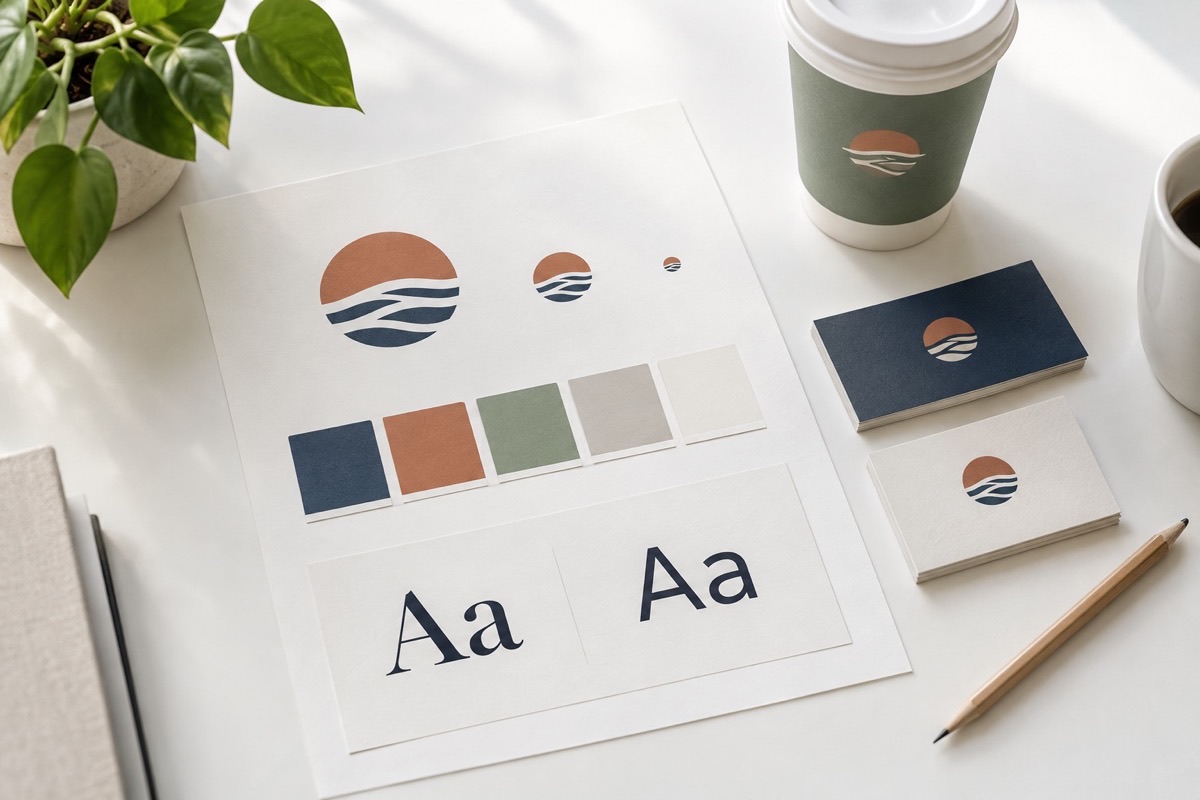
Long before a customer reads a word on your website or opens your email, they've already formed an impression. It comes from three simple things: your logo, your colors, and your fonts. Together, that's the visual side of your brand, and it's quietly telling people whether your business feels trustworthy, modern, friendly, or a little bit chaotic.
The good news is you don't need a big budget or a design degree to get this right. Here's what each piece says about you, and how to make sure it's saying the right thing.
Your logo is a handshake, not a billboard
A logo's job is to help people recognize you, not to explain everything you do. The best ones are simple enough to still make sense when they're tiny, like a social media profile picture, and just as clear when they're printed large on a sign.
Quick check: Shrink your logo down to the size of a postage stamp. Can you still tell what it is and read the name? If not, it may be too detailed.
Color sets the mood
Colors carry feelings, and people pick up on them without thinking about it. Blue often feels calm and dependable, green feels fresh and healthy, red feels energetic and urgent, and black feels polished and premium. These associations aren't universal, and they vary by industry and culture, but they're a useful starting point.
Quick fix: Choose one or two main colors, one neutral (like white, gray, or black), and one accent color for buttons and highlights. That's plenty. Using too many colors makes a business look unsure of itself.
Fonts have a personality
Just like a person's tone of voice, a font makes your business sound a certain way. Traditional serif fonts (the ones with little feet) tend to feel established and classic. Clean sans-serif fonts feel modern and approachable. Script fonts feel personal, but they're hard to read in long stretches.
Quick fix: Stick to two fonts at most: one for headlines and one for everything else. Readability always wins over style.
Consistency does the heavy lifting
Here's the secret most people miss: a great logo matters less than using the same logo, colors, and fonts everywhere. When your website, social media, emails, invoices, and signage all look like they belong together, people start to recognize you instantly. That recognition builds trust, and trust is what turns a browser into a customer.
A simple way to stay consistent is to keep a one-page "brand cheat sheet" with your logo files, your exact color codes, and the names of your fonts. Anyone who works on your marketing can use it.
A 10-minute brand check you can do today
- Gather five places customers see you: your website, a business card, your social media profile, an invoice, and your email signature.
- Lay them side by side. Do they look like they belong to the same business?
- Check that the colors match. Slightly different shades of the same blue add up to a messy impression.
- Look at your logo at its smallest size. Is it still readable?
- Write down anything that doesn't match, and fix the easiest one first.
Branding isn't about being fancy. It's about being recognizable and consistent, so people know exactly who you are and feel good about choosing you. You don't have to fix everything at once. Start small and keep going.
If you'd like a second opinion on your brand, I'm happy to take a look. Get in touch and tell me about your business.